Google Fonts has plenty of great, high quality sans-serif fonts to choose from. Its serif fonts, though, leave a lot to be desired.
It’s not just that there are no good serif fonts. Several are quite good, but don’t come in enough font weights. If you use large body text, such as on a blog like this one, a 400 weight font is going to look really thick. That’s where it’s nice to have a 300 weight light font. Unfortunately, free serif fonts tend to only have a couple different font weights, and almost never have a light version.
Lora only comes in 400 and 600, but its 400 isn’t too heavy. In my opinion, it’s the highest quality serif font for body text on Google Fonts. It’s not as flexible as Proxima Nova or Freight Text Pro, but if you’re on a budget, it can pinch hit quite nicely.
How can I make it lighter?
There are also a few CSS hacks you can use to make fonts appear a bit lighter. Since Lora doesn’t have anything lighter than 400, let’s give those a try.
-webkit-font-smoothing: antialiased;
-moz-osx-font-smoothing: grayscale;
color: rgba(0,0,0,.75);
letter-spacing: .01em;
Choosing -webkit-font-smoothing: antialiased is usually a bad idea for dark text on a white background. It’s possible to end up with blurrier text, since the default font-smoothing webkit uses is sub-pixel anti-aliasing. Webkit tends to draw light text on dark backgrounds too heavy, so choosing anti-aliasing there can be a good option. Typically you wouldn’t do that for body text. However, since our font doesn’t have a lighter weight, this will make it look lighter. Note, however, that it will be slightly blurrier, since you’re not using sub-pixel anti-aliasing. The overall effect should be improved though.
-moz-osx-font-smoothing: grayscale is a similar setting for Firefox.
Setting color: rgba(0,0,0,.75) will lighten the color of the font. This is an RGBA color, so the first three values are red, green, blue, and the final is the alpha, or transparency. I find it easier to use RGBA colors if I’m setting a transparency. Play around with the last number. .75 is 75% opaque. Find whatever works for your copy.
The last setting won’t really make the font itself look lighter. letter-spacing: .01em; will space the letters slightly farther apart. Giving the letters a little more breathing room will make it seem like there is more whitespace, which gives it an overall lighter feel.
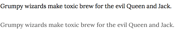
Take a look at the difference in the Lora font before and after these CSS settings are used:
Play around with the settings and figure out what works for your site. I’m finally happy with a Google Fonts serif font for body text, and that feels good!